Top Strategies for Designing Financial Product Mobile Comparison Tools
Written by Beth Robertson, Managing Director
Shopping for financial products such as a new credit card, insurance policy, or checking account can feel overwhelming in the best of circumstances. Fortunately, mobile comparison tools can help consumers navigate product details across a variety of devices to select the most effective product for their particular needs. Comparison tools that use a mobile-first approach -- including features designed explicitly for the mobile device -- help mitigate consumer frustration while meeting their on-the-go needs for choosing the right financial products. Consider these user experience insights for designing mobile comparison tools that enable a consistent experience across all devices:
Identify Central Comparative Attributes – With a mobile device’s limited screen size and landscape for evaluation, it is imperative to prioritize the most important comparative features. Choose no more than 8-10 central attributes to feature when enabling mobile comparison tools.
Clarify the Number of Comparisons – If products can be self-selected for comparison, the total number of options that can be chosen to view should be clearly stated. Generally, a side-by-side mobile comparison should address no more than two products. Some comparisons, such as those using a simple checkmark or a similar binary indicator, can better accommodate more products on a single mobile screen width.

U.S. Bank’s credit card comparison specifies the number of card products that can be evaluated.
Minimize Horizontal and Vertical Navigation – Eye tracking studies reveal that comparison charts are typically read in a “lawn mower” pattern in which the user’s eyes move left to right, then right to left, and so on. With this in mind, it’s best to limit lengthy horizontal and vertical comparisons that are disrupted by the need to scroll. Comparison tools should minimize and focus content into smaller tables to help structure information in easily digestible bites for mobile viewing. Collapsible content sections or accordions can also be incorporated to minimize vertical scrolling and enable users to quickly locate and view the specific selection factors that are most important to them.
Freeze Header Labels for Viewing – Since many comparison tables contain more content than is vertically viewable on a single mobile screen, the product column header labels should be visually retained by freezing or pinning them in place so that they can serve as a ready reference point as a user scrolls the length of the table.
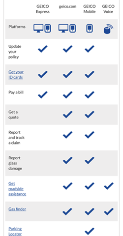
GEICO provides a comparison chart highlighting features accessible through various digital channels. Use of a binary checkmark indicator enables more than two comparisons to be readily viewed on a single screen without the need for horizontal scrolling.
Enable New or Additional Comparisons – When a user has reviewed two or more products but is not ready to transition to making a final selection, provide the option for shoppers to compare additional products or to compare one of the already reviewed products with an additional product. A link to “Compare Other Options” or “Deselect” should enable users to easily remove or add product options for assessment.
Incorporate Color and Visuals – Various studies have shown that up to 65% of people are visual learners and that the human brain processes visual information faster and retains it longer than it does text. For these reasons, comparison charts should clarify the differences among products and use visuals and color to highlight each product and its distinctive features. In addition, contrast is important for mobile readability and drawing a user’s eye to core content or actions. Use of color and contrast is also central to mobile accessibility.

Chase’s comparison table for premium checking accounts enables comparisons to be viewed on a single screen width. Component labeling within the table, rather than to the left, helps to maximize the horizontal real estate available for comparative content.

Images and color provide visual appeal in Bank of America’s credit card comparison table. Headers remain pinned to the comparison as a user scrolls vertically.
Look for our related post, Mobile Comparison Tool Considerations for A More Seamless Consumer Experience.